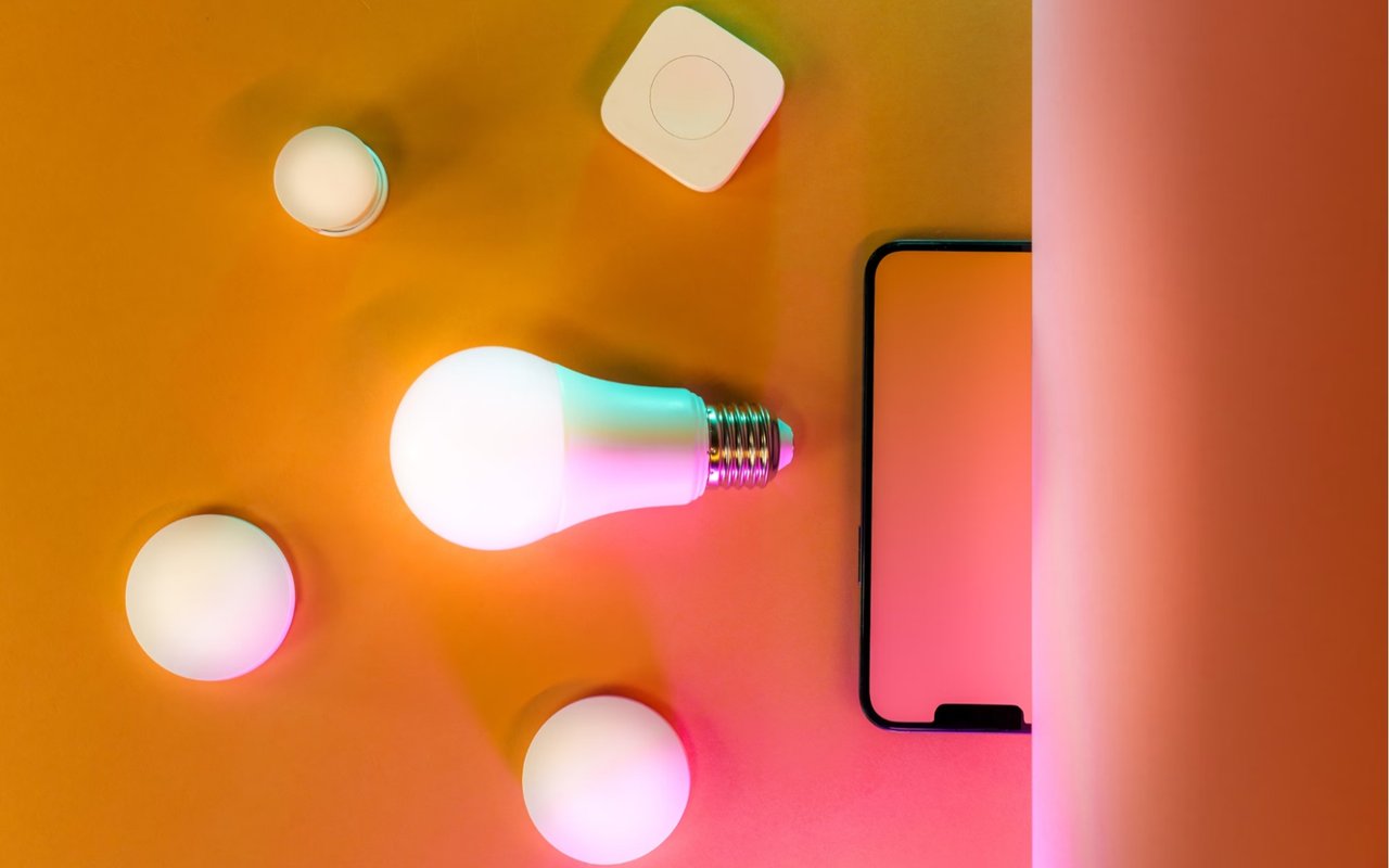
Color isn’t just about aesthetics — it’s also about emotion. The shades you choose can energize, calm, inspire, or even make a space feel more luxurious. When it comes to design and decor for your Beverly Hills home, understanding color psychology can help you create an atmosphere that feels effortlessly sophisticated, inviting, and perfectly tailored to your style.
Every room has a personality, and the right colors can bring it to life. Whether you want a living room that features refined elegance, a serene bedroom that feels like a five-star retreat, or a kitchen that sparks creativity, color can set the perfect ambiance. Here’s how to use color psychology to transform your living space.
The Power of Color: Why It Matters in Home Design
Color has a direct impact on how you feel the moment you step into a space. It can make a room feel larger, cozier, brighter, or more dramatic. In Beverly Hills, where home design is an art form, choosing the right palette is key to creating a space that not only looks stunning but also feels exactly the way you want it to.
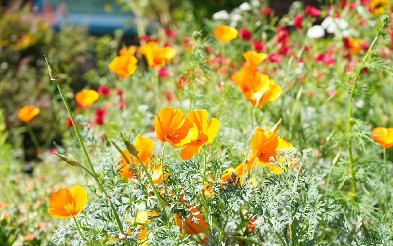
Soft neutrals can make a home feel timeless and elegant, while deep, moody tones add intrigue and depth. Bold hues bring energy, while pastels create a sense of calm. Understanding how different colors affect mood can help you design a home in Beverly Hills that’s both visually striking and emotionally inviting.
Soft neutrals can make a home feel timeless and elegant, while deep, moody tones add intrigue and depth. Bold hues bring energy, while pastels create a sense of calm. Understanding how different colors affect mood can help you design a home in Beverly Hills that’s both visually striking and emotionally inviting.
Setting the Right Tone in Your Living Room
The living room is where you entertain, unwind, and make a lasting impression. This space should feel inviting, stylish, and effortlessly chic.
For a refined, timeless look, warm neutrals like soft beige, taupe, or light gray provide a sophisticated foundation. These shades work beautifully with rich textures — think plush velvet sofas, silk drapes, and statement lighting. If you prefer a bolder aesthetic, deep blues or emerald greens create an upscale, moody vibe. These colors feel both dramatic and elegant, making them perfect for Beverly Hills luxury.
Are you going for a more airy, relaxed feel? Soft pastels like muted sage or powder blue keep the space feeling fresh while maintaining an upscale charm. If you love a little glamour, an accent wall in charcoal or navy paired with metallic finishes can add the perfect touch of drama.
Elevating Your Kitchen with Color
A well-designed kitchen should feel both functional and inspiring. The right colors can enhance natural light, emphasize architectural details, and even influence your mood while cooking.
Classic white kitchens remain a favorite because they feel bright, clean, and endlessly stylish. If you want to add depth and character, deep navy or forest green cabinetry with brass or gold hardware can bring a sense of modern elegance.
For a cozy, sophisticated feel, warm neutrals like greige, honey, or soft taupe create an inviting atmosphere. A bold backsplash in rich jewel tones — think emerald, sapphire, or even a deep aubergine — can add personality without overpowering the space.
If you prefer a more playful, artistic vibe, try a pop of unexpected color. A soft blush pink island or a sky-blue accent wall can add warmth while keeping the space effortlessly chic.
Designing a Luxurious Bedroom
Your bedroom should be your retreat — where stress melts away and relaxation takes center stage. Choosing the right color palette is essential for creating that perfect sanctuary.
Soft, muted hues are best for promoting rest. Dusty blue, warm taupe, and pale sage green all have a calming effect, making them ideal for walls or bedding. For a more dramatic, ultra-luxurious feel, deep jewel tones like sapphire, plum, or rich emerald bring a moody sophistication that feels like a high-end hotel suite.
Love a light, airy look? Crisp white or soft ivory creates a fresh and peaceful environment. Layer in texture with plush bedding, velvet pillows, and a statement rug to keep the space feeling cozy. If you want a touch of glamour, an accent wall in charcoal, deep indigo, or even a rich espresso tone can create stunning contrast without overwhelming the space.
The Dining Room: Where Color Sets the Tone
Whether you’re hosting elegant dinner parties or casual gatherings, the right colors can enhance the dining experience. Deep, rich shades like burgundy, navy, or charcoal create a warm setting that feels effortlessly luxurious. These colors pair beautifully with gold accents, statement chandeliers, and rich wood furniture.
For a more inviting and modern approach, warm neutrals like soft beige, greige, or creamy taupe keep the space feeling stylish yet relaxed. These shades allow artwork and decorative elements to stand out without competing for attention.
If you want a bold, artistic statement, jewel tones like emerald green, deep sapphire, or even a dramatic terracotta can add vibrancy while maintaining an upscale aesthetic. Pair them with velvet dining chairs or a marble table for an added touch of luxury.
Creating a Spa-Inspired Bathroom Retreat
Bathrooms are no longer just functional — they’re personal sanctuaries. The right colors can turn your space into a spa-like retreat that feels both indulgent and refreshing.
Soft neutrals like warm white, pale taupe, or light gray create a timeless, elegant look. These shades work wonderfully with marble finishes, gold or matte black fixtures, and elegant lighting. If you prefer a modern, edgy feel, deep charcoal or matte black can add a dramatic yet impressive touch.
For a refreshing, tranquil atmosphere, soft blue or muted green tones bring a calming effect. Seafoam, dusty blue, or pale sage paired with natural materials like stone and wood create a Zen-like ambiance. If you love a bit of glam, soft blush or champagne hues can add warmth while keeping the space refined and chic.
Boosting Productivity with a Stylish Home Office
A well-designed home office can enhance focus, creativity, and productivity. The right colors can help you stay motivated while making the space feel polished and inspiring.
Deep blues promote concentration, while muted greens like sage or moss encourage balance and creativity. If you want a dramatic look, charcoal or deep aubergine can make a bold statement while maintaining an elegant aesthetic.
For a bright, open workspace, warm white or soft beige keeps the space feeling light without being too sterile. Adding a pop of color — like a navy accent wall or a muted mustard chair — can bring energy without overwhelming the room.
Bringing It All Together: Creating a Cohesive Look
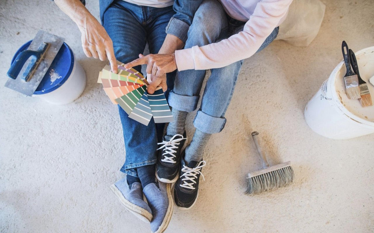
A well-designed home has a color palette that flows seamlessly from one space to another. Sticking to a core set of colors — neutrals with strategic pops of deeper hues — creates a cohesive, harmonious feel.
Love bold colors? Use them intentionally on an accent wall, through statement furniture, or in carefully curated artwork. Balancing warm and cool tones ensures a visually appealing contrast that enhances the overall design.
Ultimately, color is one of the most powerful tools in home design. Whether you want a soothing retreat, a high-energy space, or an elegant, timeless aesthetic, the right hues can transform your Beverly Hills home into a masterpiece.
If you’re hoping to find the perfect home in Beverly Hills or achieve a winning sale, Forster Jones International is by your side. Connect today.